Designers Research and Design Proposal
Since I will be developing my own design brief, below are the three designers that i have found most profound and inspirational to my final work for that.

https://www.behance.net/gallery/14101847/Brooks-World-Above-Branding
"Create art for yourself and in time everyone else will follow."
|
Jared NickersonOriginally from Halifax, Nova Scotia and is now based in the U.S in Seattle. His focus is primarily on Character Design, Illustration and Graphic Design. Jared is a multi-talented individual with interests that range outside of is design, them being song writing and music production. On his free time, he enjoys traveling, collecting figurines and spending time with his two pugs which he likes to call the "Fur Children" or "Sisters of Destruction".
He owns Jthree Concepts, which is a Seattle-based design studio with focus on character, logo, videogame, editorial and textile designs. Their clients include Nike, Adidas, Coca-Cola and many more. 
https://www.behance.net/gallery/33724830/Nickelodeon-Franchise-Pattern
Why Jared?
I've always been drawn to bolder colors and fun graphics when it comes to characters and logo design. Jared is one of those designers that easily manages to capture my attention by his skillful incorporation and synchronization of colors and line that doesn't overwhelm. He inspires me to create colors, which i definitely want to involve in my own design.
|

Nicki van Roon
An innovative, award-winning 28 year old Danish multidisciplinary designer focusing in the fields of typography, branding and packaging designs. He currently works in Denmark, being the co-founder of Roon & Rahn.
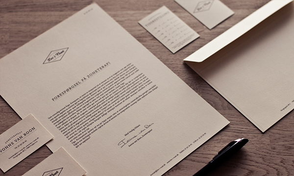
https://www.behance.net/gallery/4700065/Lev-i-Nuet-Corporate-Identity
|

https://www.behance.net/gallery/4062301/Deattached-The-Secrets-I-Keep-(Pop-up-album-cover)
Why Nicki?Nicki van Roon's work is very inspirational in a sense of very cut-clean designs. He uses simplicity to his benefit, which proves a point that design is not all about detail. I think that Nicki's works are those that easily manage to catch attention without much use of color. He is the opposite of Jared Nickerson, which balances out his vivid use of color, and pushes me forward to create things that are practical but creative. I see a very bright future for his company because he contributes to modern preferences very well.
|
Yurko Gutsulyak

Yurko is a Ukranian designer who works in graphic design, print and branding. He is a very innovative thinker, however unfortunately his personal information is not out on the web. Despite that I did not want to exclude him because his designs is what i believe push the advance of modern design, as he strongly contributes to my creative thinking. He runs a website that sells his products on oooo.com.ua.

https://www.behance.net/gallery/1205669/Trash-Calendar
|
https://www.behance.net/gallery/4185907/Watching-Calendar
Why Yurko?Similar to Nicki, Yurko's work inspires me to design something that's simple, yet you can tell that so much work was put into the designs. He makes me want to either buy or design my own office supplies or calendars or something of that sort because this guy is very desk-space or work-space oriented.
|
Compare and Contrast

Yurko's work: https://www.behance.net/gallery/5376547/Velkopopovicky-Kozel-Limited-Edition
Jared's work: https://www.behance.net/gallery/9706499/Drowned-Harbor
Jared's work: https://www.behance.net/gallery/9706499/Drowned-Harbor
Proposal
All three of these designers inspired me to want to create a simplistic design for a stationery tool (e.g for writing) with all of the elements from these designers (use of vivid color, creative packaging, necessary and simplistic). I will begin by designing possible layouts in Photoshop and branch out from there.
What marks success?
1. Easy to use and for daily purposes
2. Eye-catching but simple design
3. Represents me as a designer
What marks success?
1. Easy to use and for daily purposes
2. Eye-catching but simple design
3. Represents me as a designer
